The Brief
The UK Shoulder Clinic had a website but it was letting them down in a few ways: the design, functionality and SEO. This in turn was having a negative impact on their business. The brief was to redesign the site, fix the aforementioned issues with the new build and find a way to help patients decide on the best course of action by answering the most common questions right there on the home page.
Deliverables
Website
The Solution
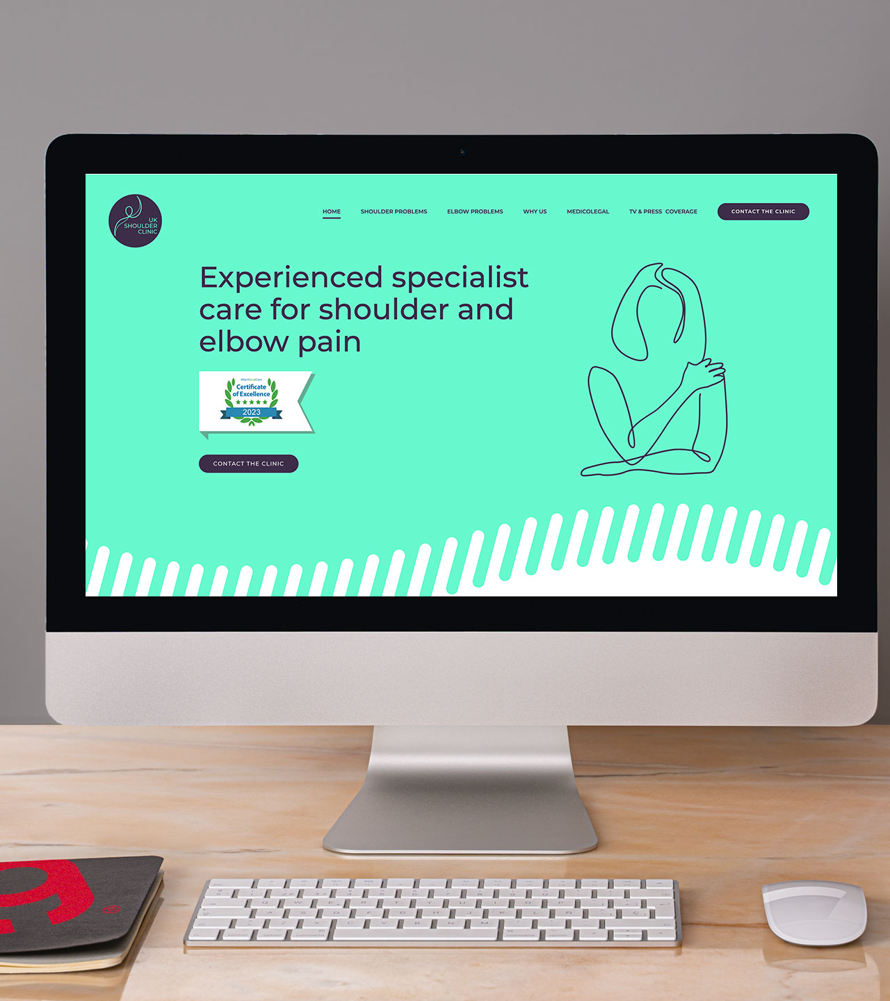
All projects undertaken by Gulp Creative include a period of research, the colourway of purple and ‘scrubs’ green was decided on following that research. The colours deliver a clinical feel through the green and a friendly/approachable one with the purple.
Users of any site should be able to establish they are in the right place as fast as possible but for the Shoulder Clinic it was also important for users to be able to contact the clinic simply and directly from the home page.
To help answer the most common questions we designed a way users could answer for themselves what the best course of action might be for their condition. Gulp devised a simple “Do I need to see a surgeon about my shoulder pain?” decision-tree style questionnaire.
Animation
Gulp illustrated figures and then created the transitions between the different age groups in the form of an animated svg ensuring things stay sharp on any device and file sizes are kept small.
The new site has a low level of interaction animation keeping the journey professional and simple.
Conditions
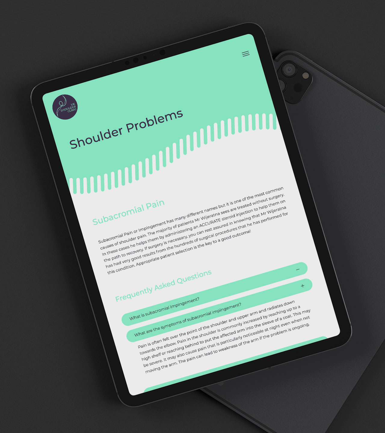
Pain symptoms were broken down into six areas each containing simple user friendly condition descriptions to help potential patients narrow down what the problem might be. They can then click through to further info on a condition-dedicated page.
Condition pages
Each condition page has Frequently Asked Questions some also include videos covering further details and surgery information.
Contact options
The UK Shoulder Clinic works out of more than one hospital, because of this, it was vital all the attendance location times and contact details were provided in an easy to digest way. Along with this, Gulp also built a drop down into the contact form to allow users to pick their preferred hospital. We also illustrated a bespoke set of maps to help users locate each of the three hospitals.
What Now?
Like this project? Reach out to see if we can help your business (assuming you can do so without any shoulder pain).
