The brief
A new business is always exciting, one that allows you to stay within stunning grounds around the UK… in a tree house – is off the scale! Our brief was to design a logo that encompassed this, represented the proposition and one that would sit comfortably alongside any established venue branding.
Deliverables
- Logo
- Brand guidelines
- Website holding page
The logo
Tasteful in shape and colour.
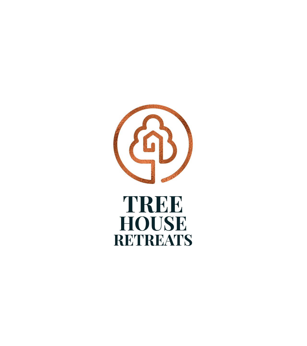
The solution
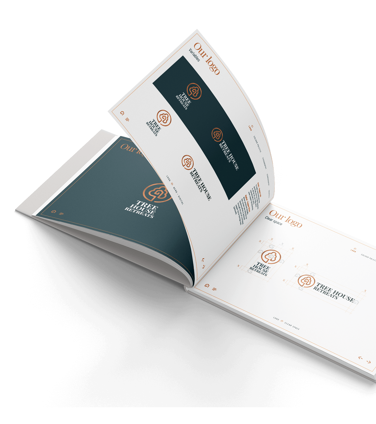
The logo is quite simply a visual representation of the product, a stylised house, in a tree within a contained area. This simplicity is perfectly representative of the concept – back to nature, simplicity itself. Colours chosen are a deep regal blue and copper. The typeface is a classic serifed choice also representative of the history behind the estates. This contrasts perfectly with the contemporary clean lines of the logo mark.
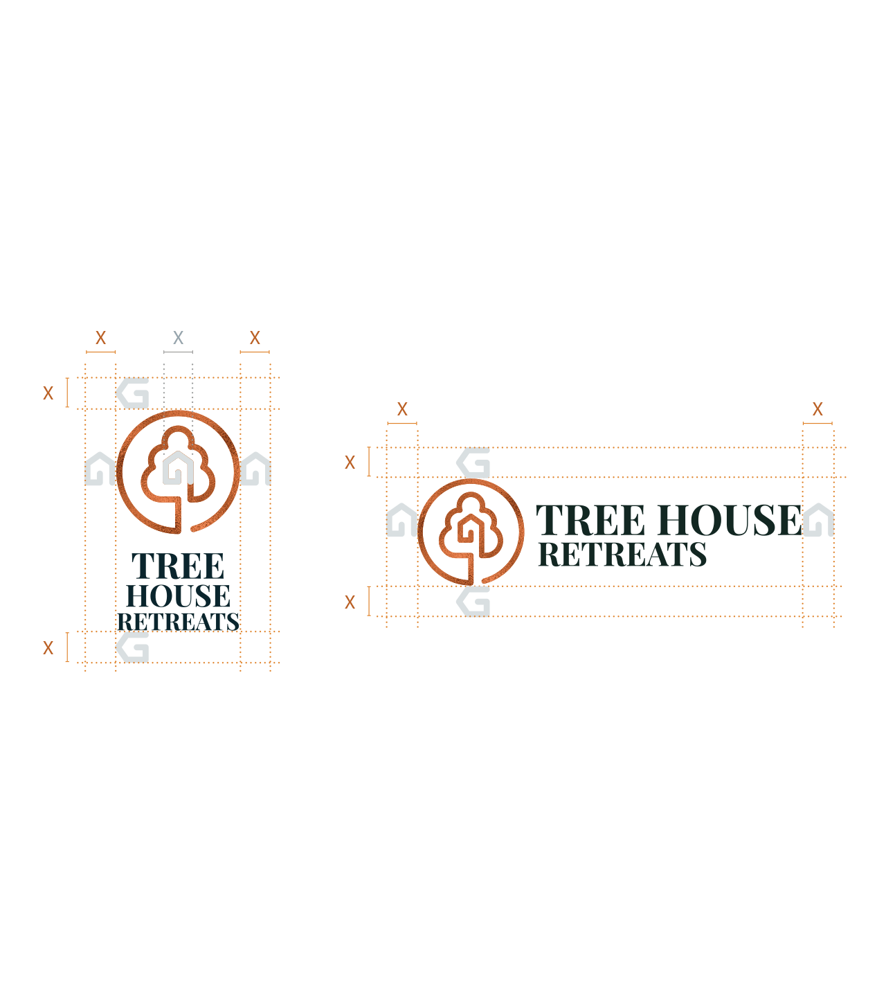
Variations
Flexible portrait and landscape options.
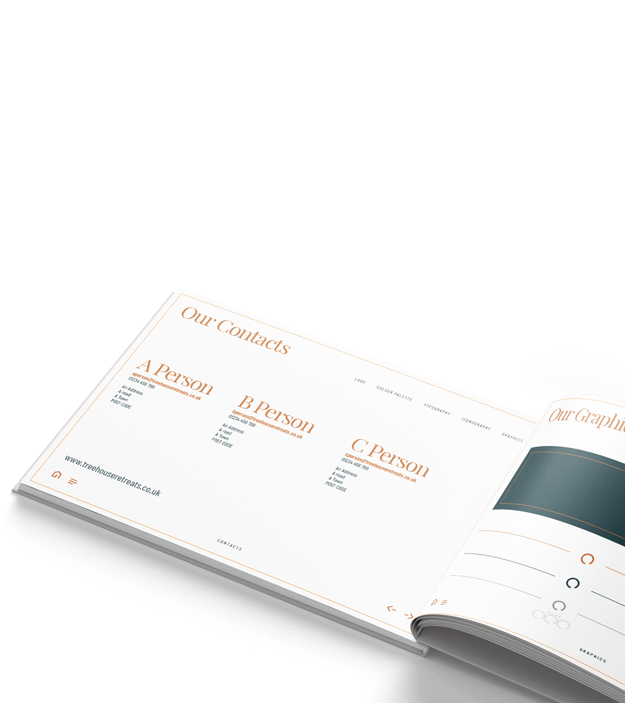
Brand book
Guidelines to ensure consistency.
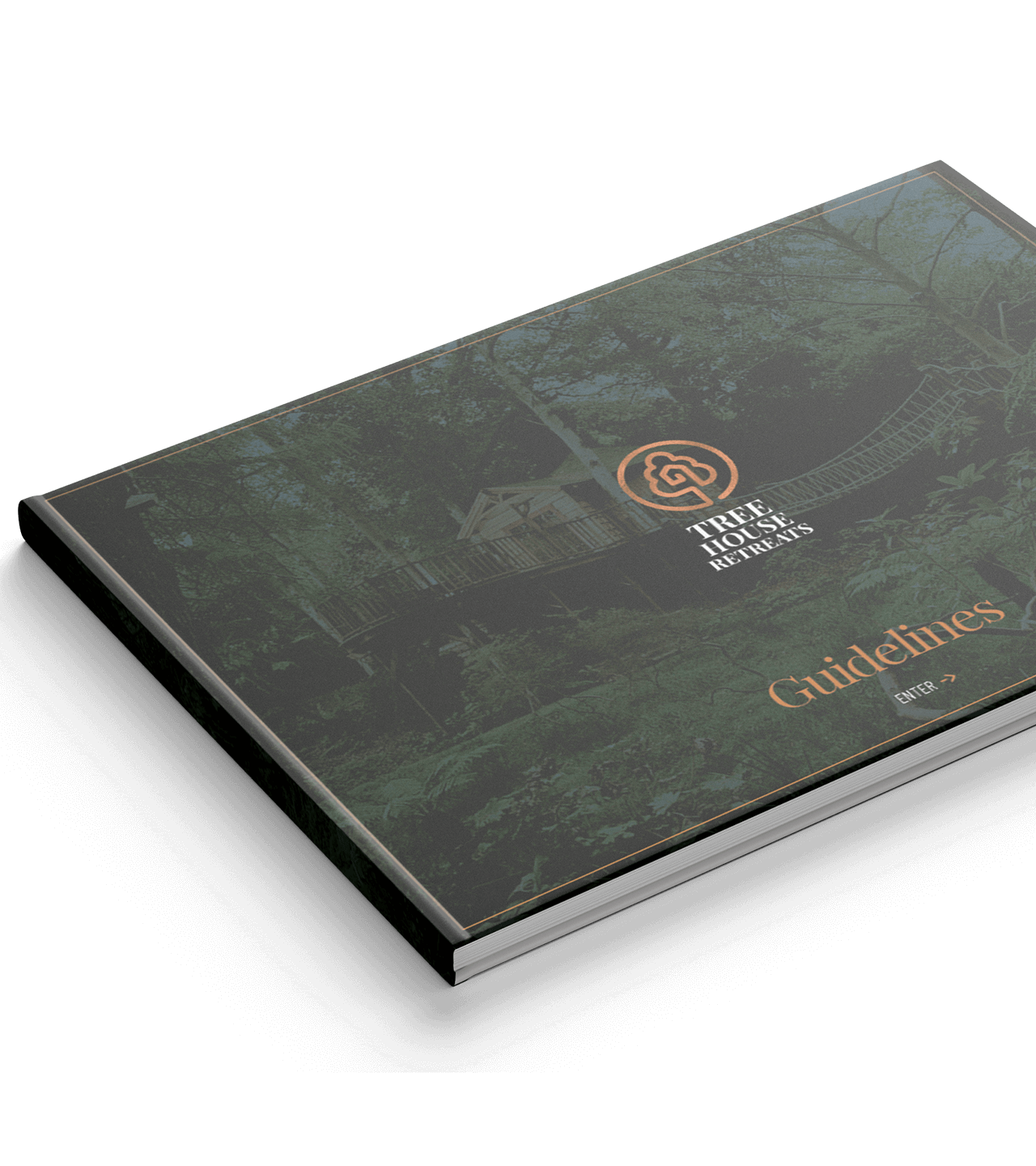
Brand book
Guidelines covering logo use.
Brand book
Icon development.
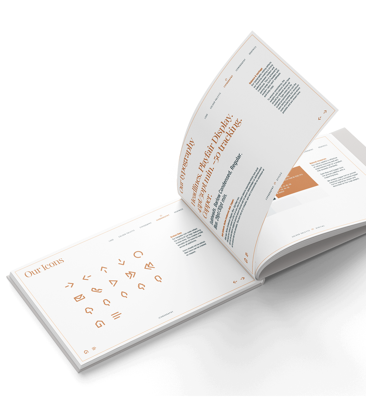
Brand book
Use of typography.
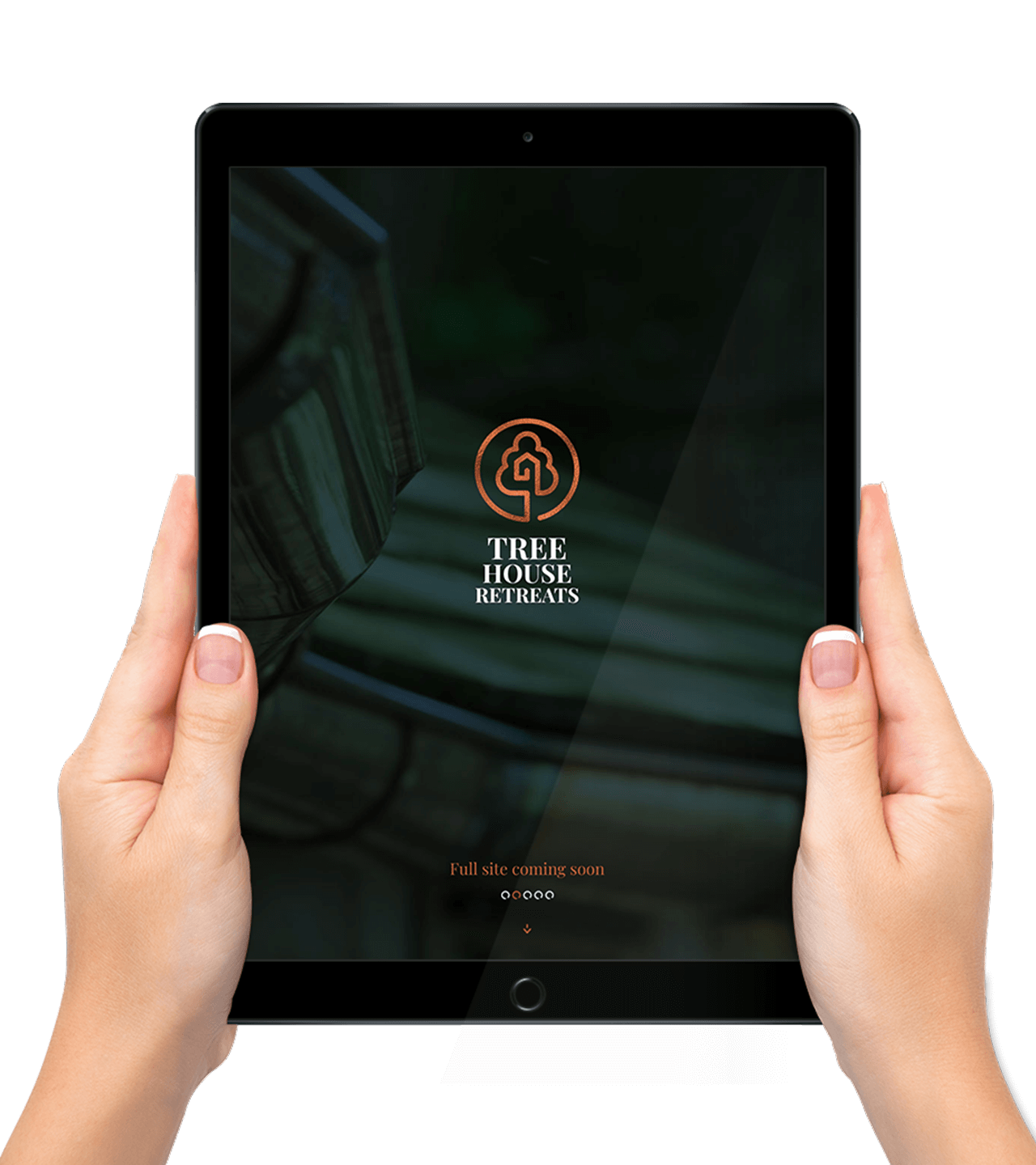
Website
Simple holding page.
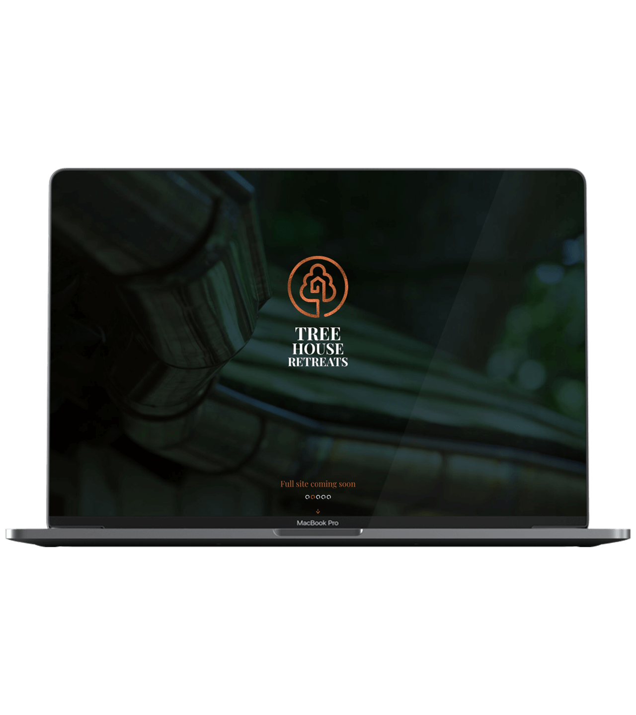
Website
Responsive to all devices.
Visit Site