The brief
To create a logo and branding for a student union café. The challenge was to create a visual link to the Student Union, but due to its location outside of the university, it should welcome everyone, and shouldn’t feel exclusive to students.
Deliverables
- Logo
- Brand Guidelines
The logo
Modern, industrial, with links to the venue.
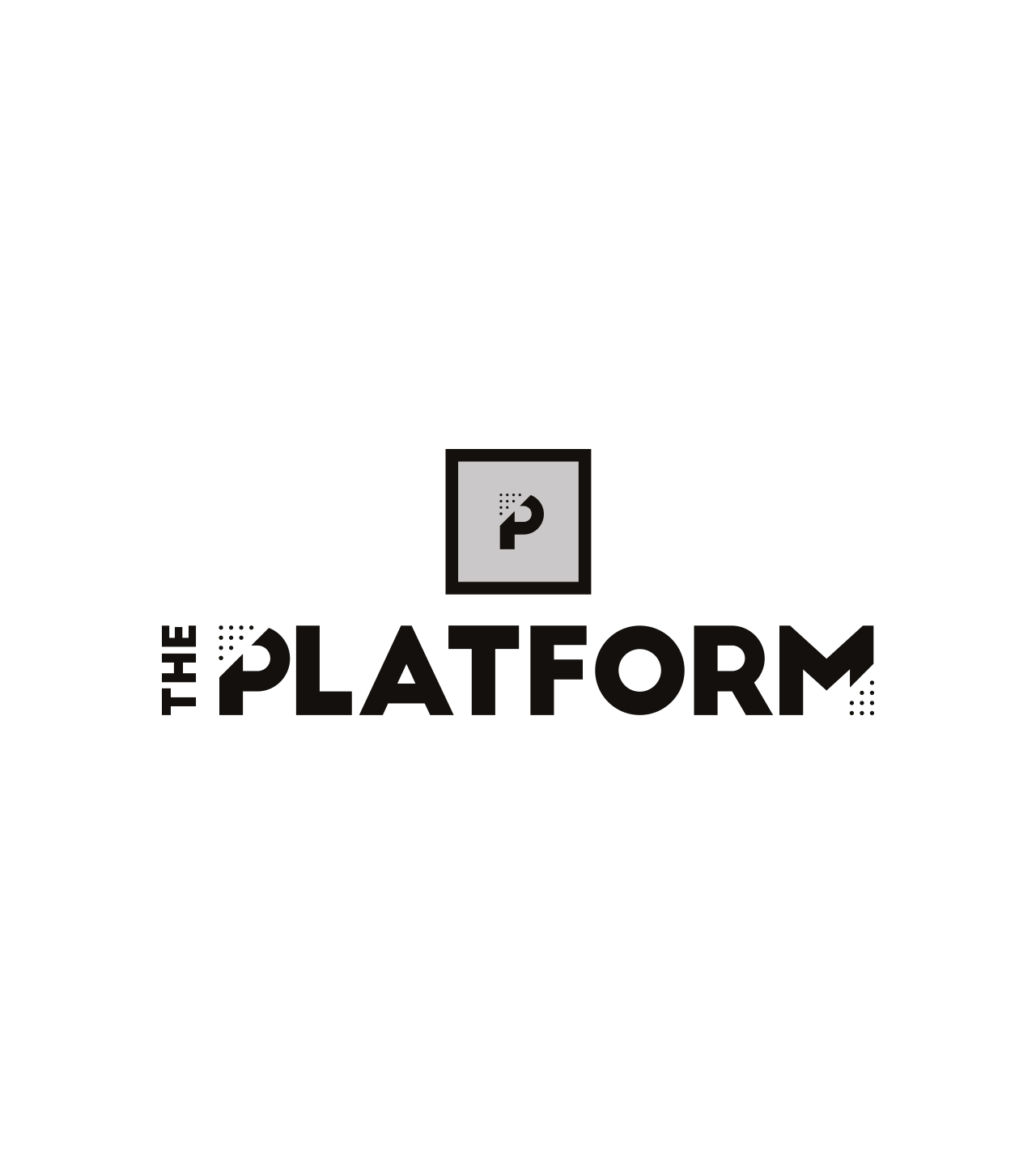
The solution
The venue was a big lead here. Set in an old industrial train shed, the platform suited it perfectly as a name and was collectively agreed upon from the start. It brings a double meaning in that it’s a platform to perform (on stage inside) along with the more obvious ties to a train station platform. The dots used within the logo and throughout the branding stem from the raised dots found at the edge of a station platform. Colours are deliberately industrial in feel to further tie the logo to the venue.
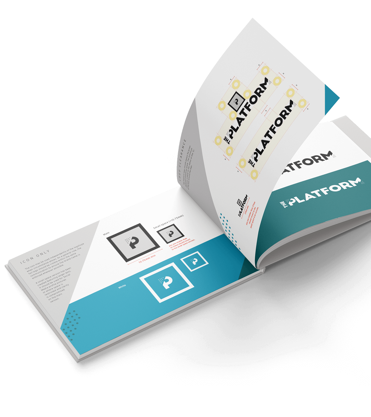
Logo options
Flexible for maximum effect in all situations.
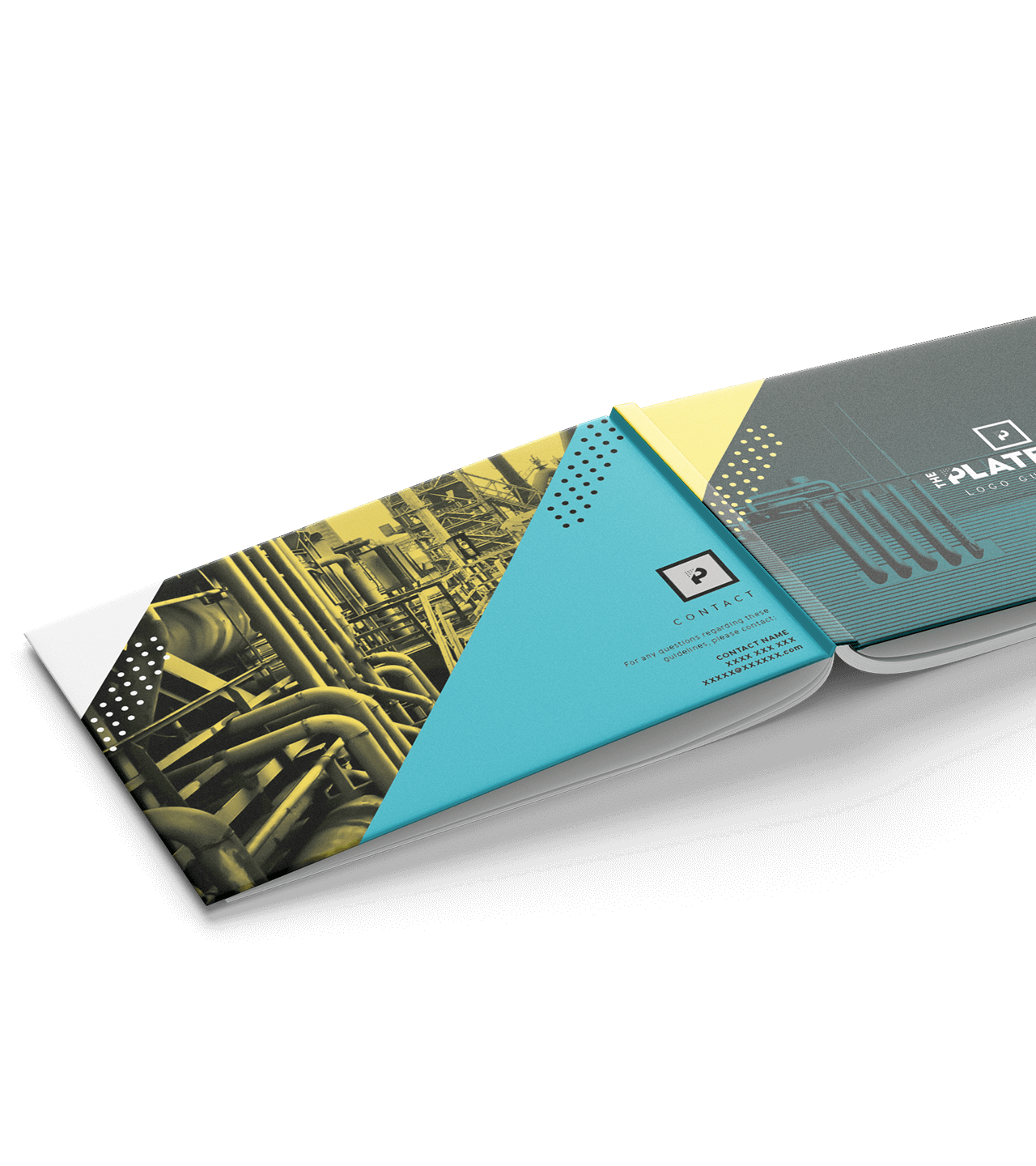
Imagery
Industrial imagery to support the brand.
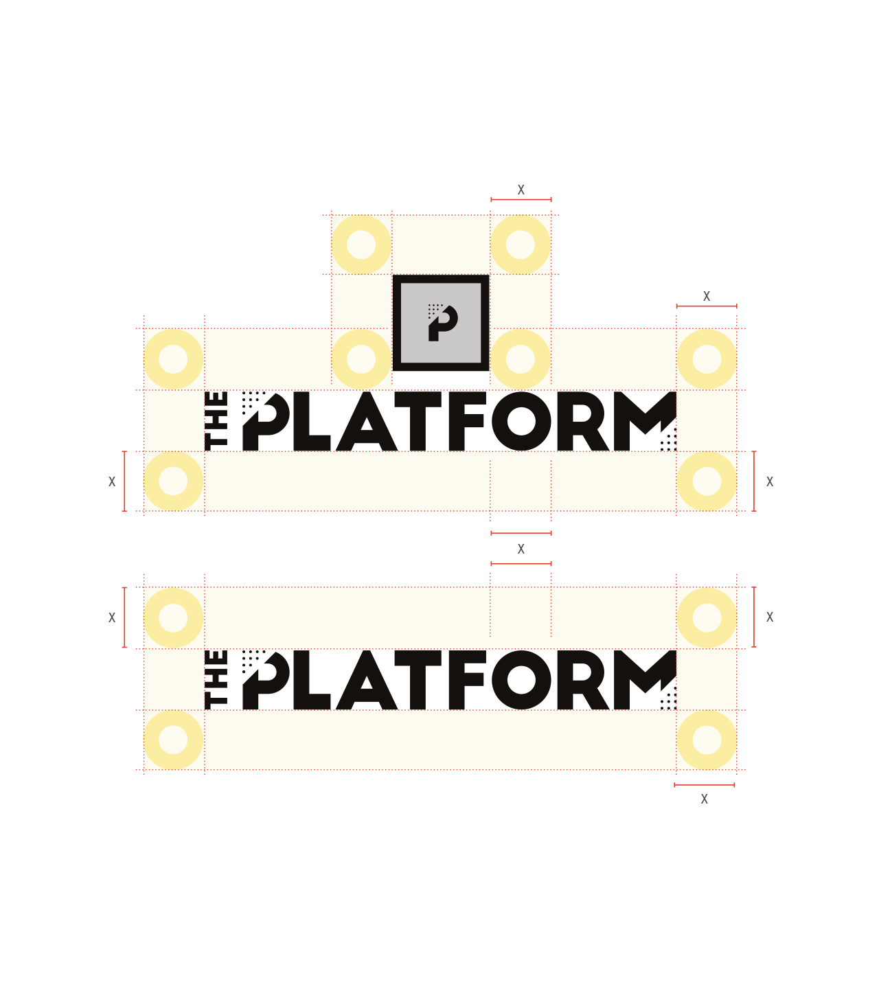
Guidelines
Defining those dos and don’ts.
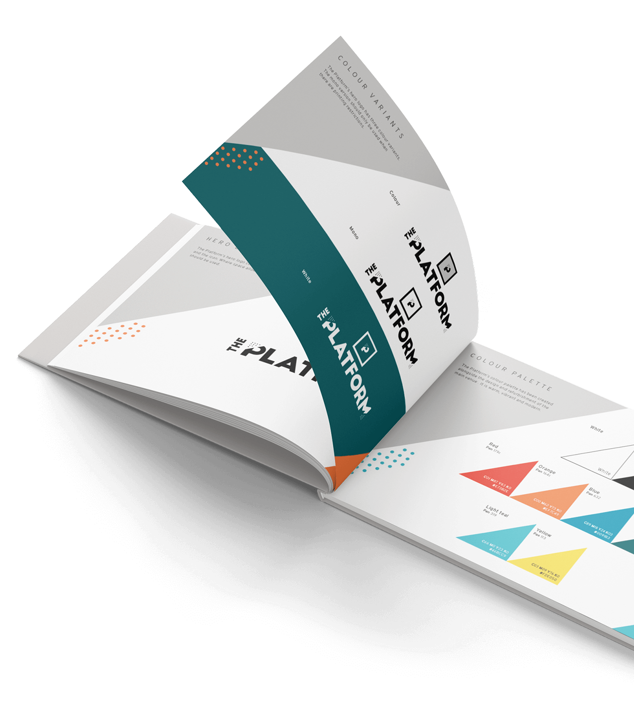
Guidelines
Allow consistency through application.
Concept
Contemporary meets industrial.