M P Hare: Branding for Builders
Improving homes for the long term
The Brief
M P Hare are an established, high-end building firm they came to us for branding for builders who work on recommendation. Extensions, loft conversions and refurbishments of Victorian property are their bread and butter, and their clients love them for it. The brand, though, hadn’t kept pace with the quality of the work.
They wanted a look that matched the service they deliver: clean, confident and considerate. They spend their days inside older homes, so anyone meeting the brand for the first time needed to feel they could trust it.
Deliverables
Logo design
Colour palette
Strapline
Website design and development
Digital stationery templates
The Solution
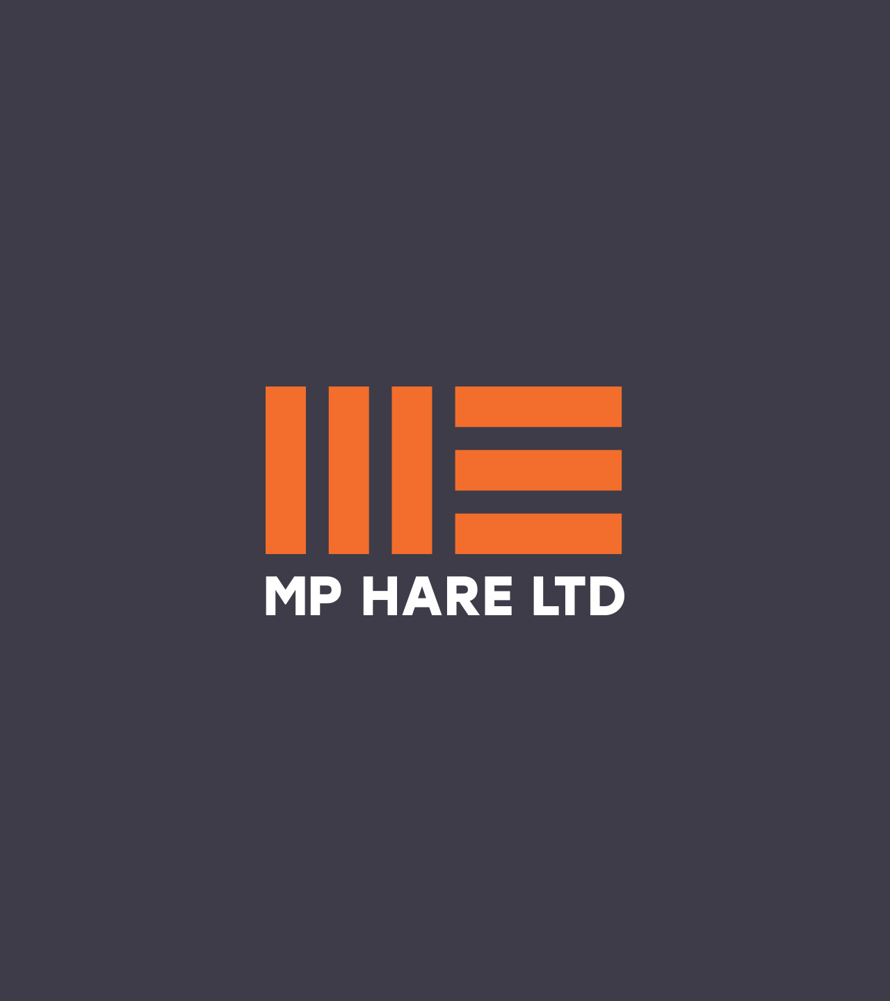
We gave M P Hare a strong new logo pairing red-brick orange with regal purple. The orange nods to the trade, the purple adds a touch of grandeur, and a bold sans serif typeface sits alongside the brandmark so the whole thing looks assured without shouting about it.
Icons for each building specialism
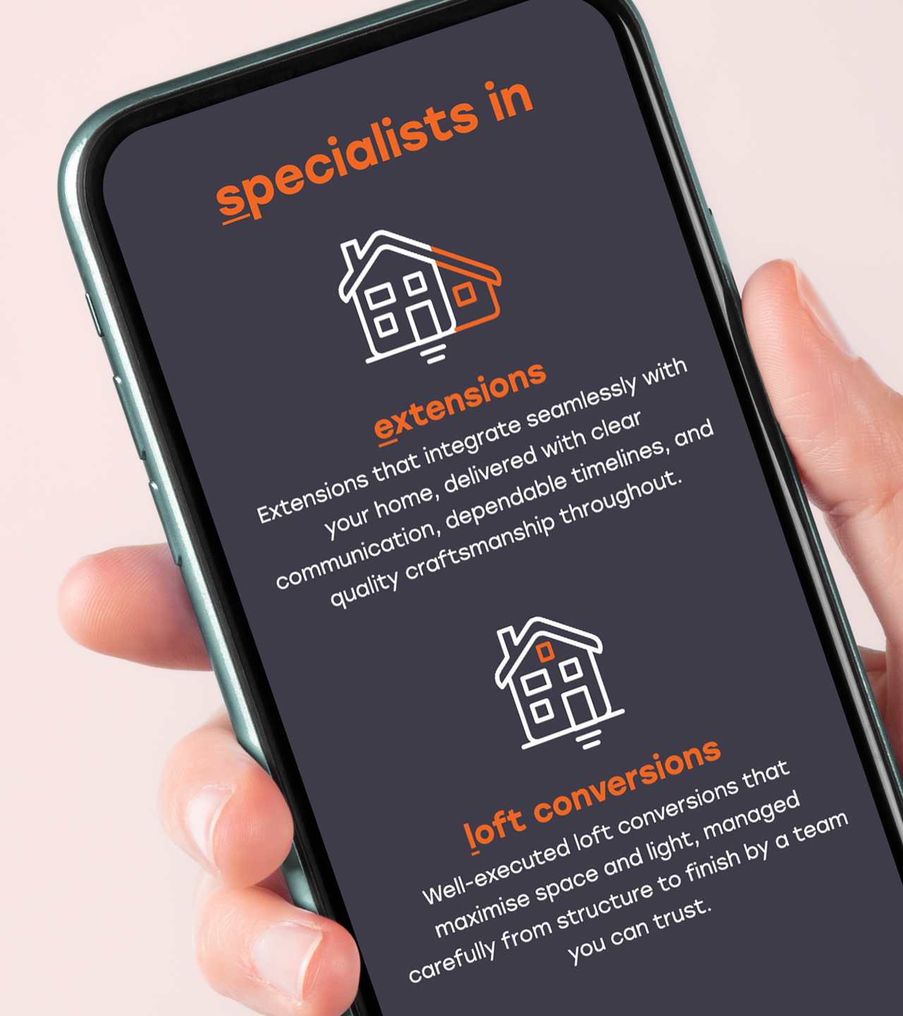
Each of M P Hare’s specialisms now has its own icon, with the orange section of each one picking out the speciality. They work as quick visual signposts on the website and across the rest of the branding.
A website for high-end builders
The new M P Hare website is built to feel calm, which is exactly how a good builder should feel to deal with. Layered scrolling and content that loads as you move down the page give prospective clients an easy, considered way to get to know the company and the projects they take on.
Branded workwear
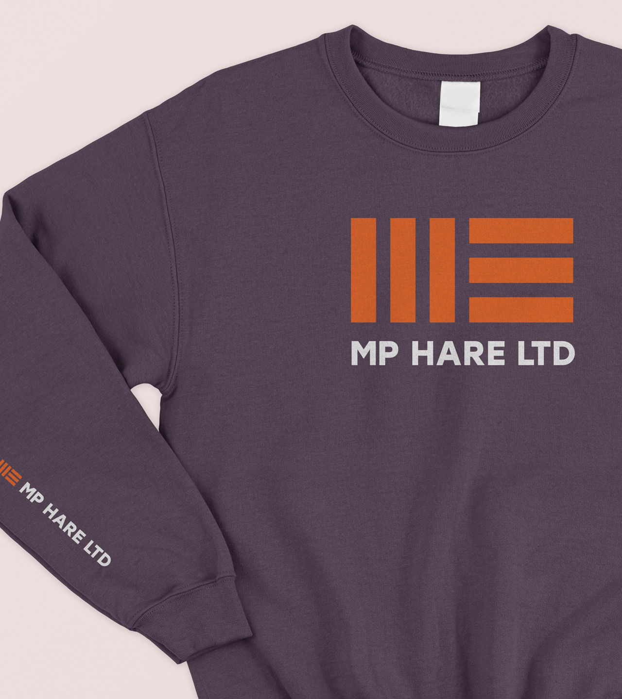
We couldn’t resist showing sweatshirts with the new logo on them. A brand for a building company has to cope with site life, and this one looks as good on a hoodie as it does on a website.
Debris Netting
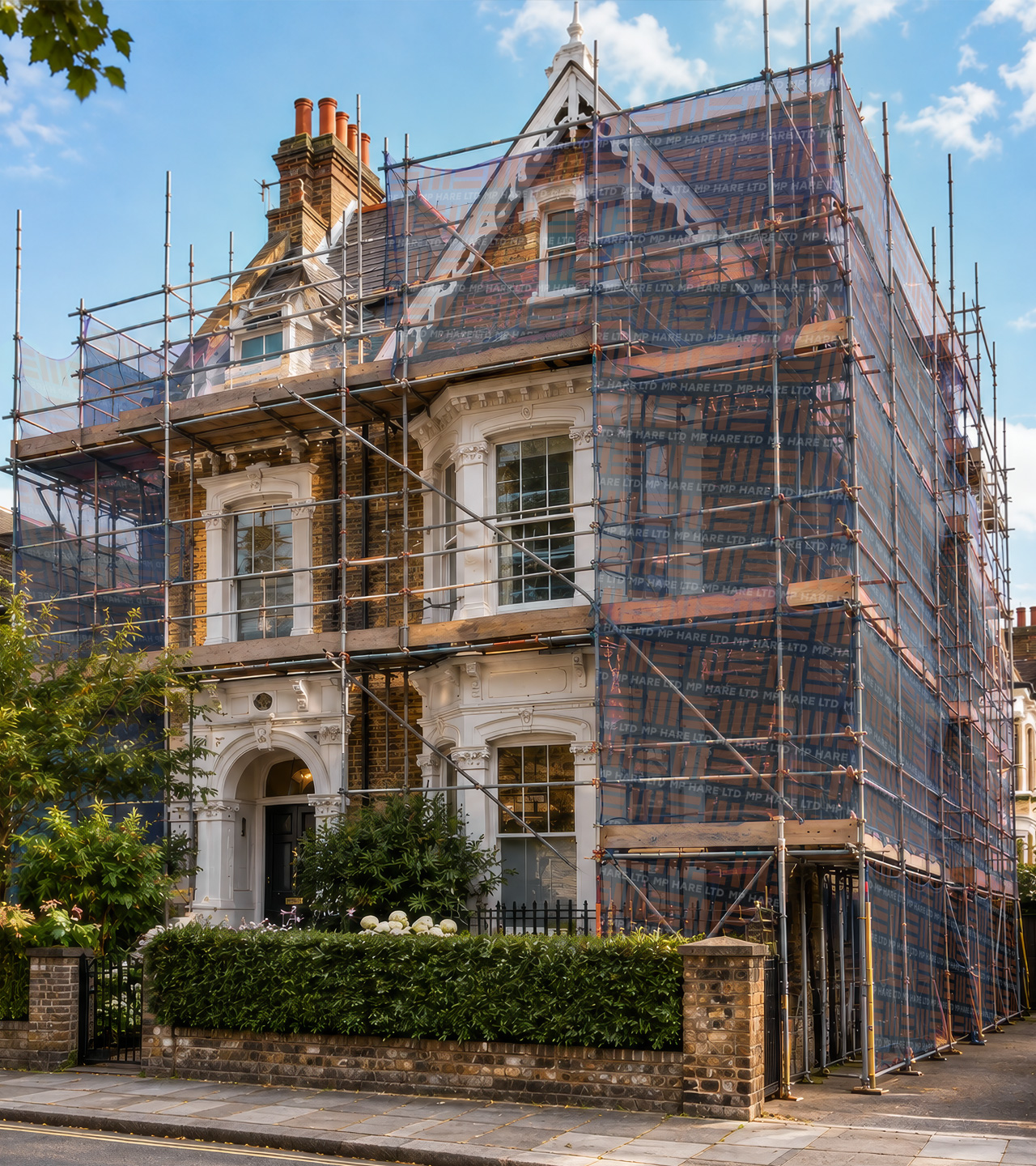
There’s nothing like this to announce your presence! Branded scaffold netting absolutely confirms who’s working where.
Like what you see? We can design and build you something bespoke too.
Call 01892 61 8000 or get in touch here.