The brief
To redesign the Blue Forest logo to provide a stronger more contemporary solution with brand development that would work across the board covering print, web and social media.
Deliverables
- Logo
- Brand development
- Stationery suite
- Digital brochures
- Presentation folder
Where it began
As ever, ideas were discussed, explored and rejected before we came to the winner. We wanted to create something that Blue Forest could truly own. To achieve this it had to be unique, link to the trees but have depth behind the thinking.
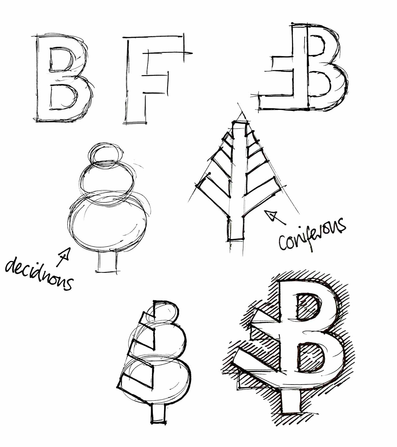
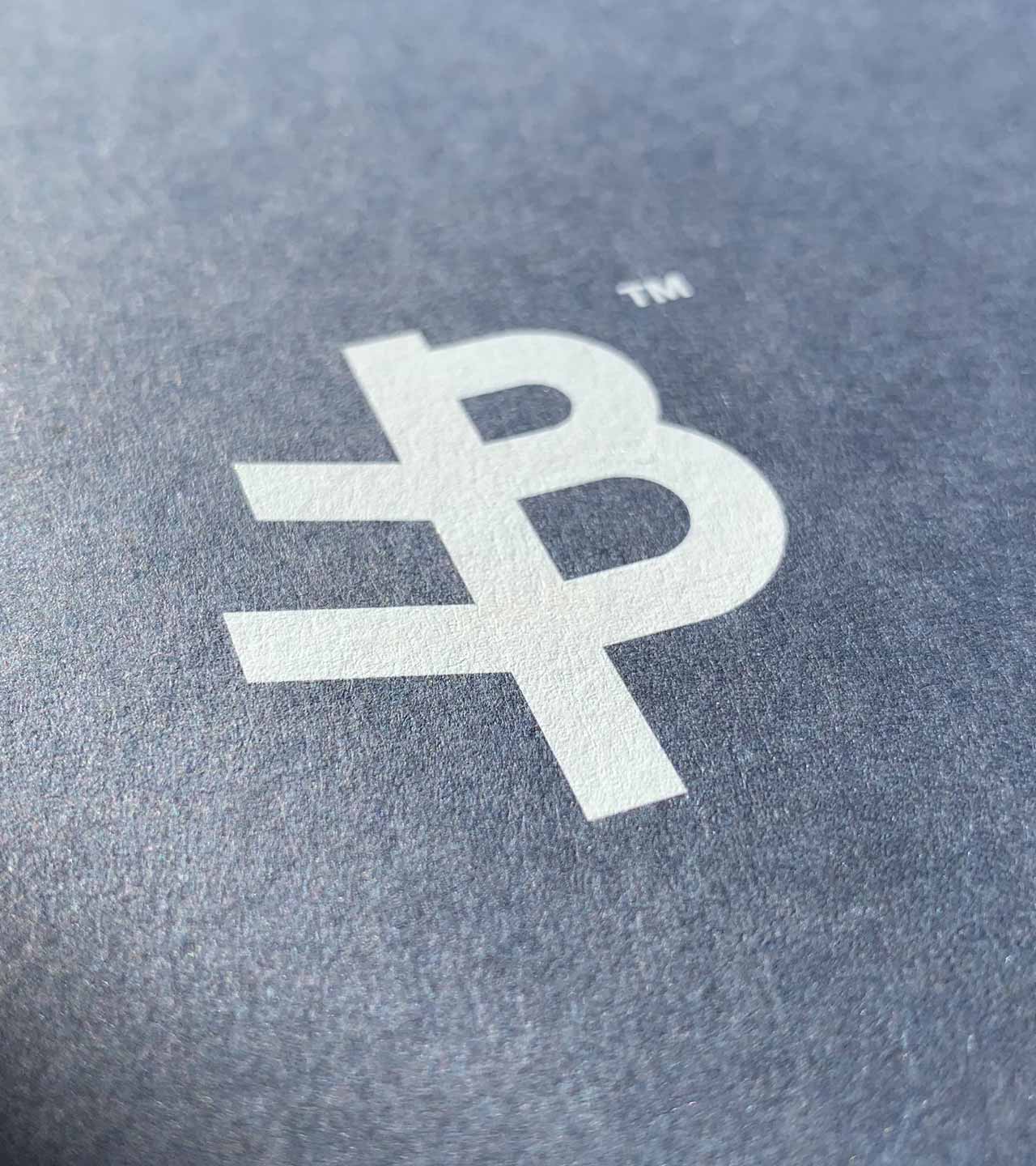
The Solution
Following many sketches we developed the idea of covertly using the Blue Forest initials combined with tree sketches to create a hybrid stylised deciduous/coniferous tree.
Rotating the ‘F’ 180 degrees and angling the Arms created branch like bars on the left. Sitting this back to back with the letter ‘B’ so the letters shared the stem worked perfectly. The F representing a coniferous tree, the B creating a deciduous tree.
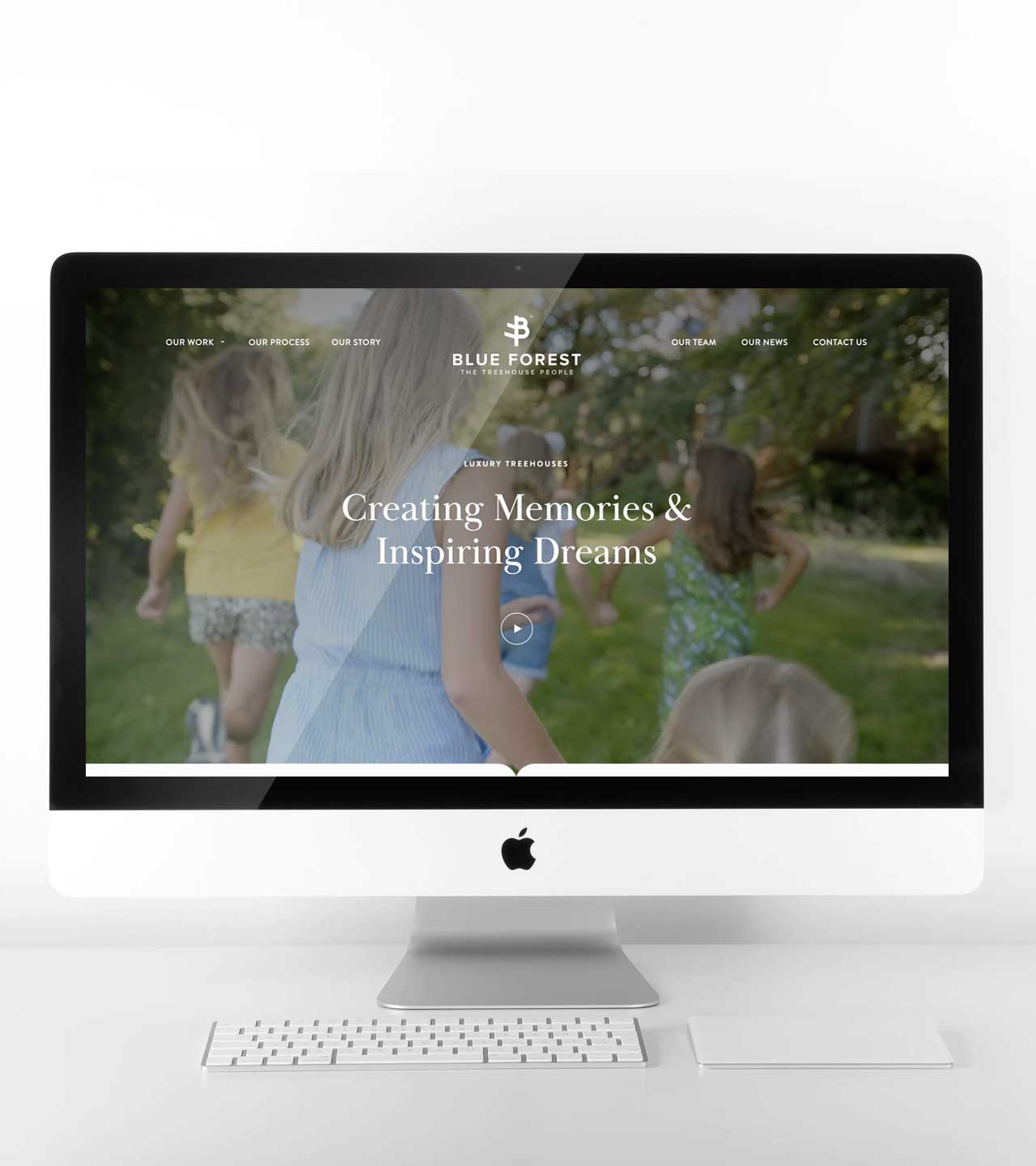
Website
The logo slotted perfectly into the new website with the icon itself working well as a social media identifier/avatar.
Collateral
Following logo approval, we designed and produced a full stationery suite covering 600gsm business cards (with burnt-into-wood logo on the back), compliment slips, letterheads and a presentation folder printed in white ink at the same size as the oversized brochures.
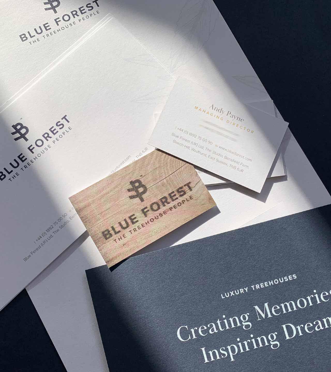
Brochures
The two existing brochures were then redeveloped following the now established brand rules. One for corporate clients and one for private clients.

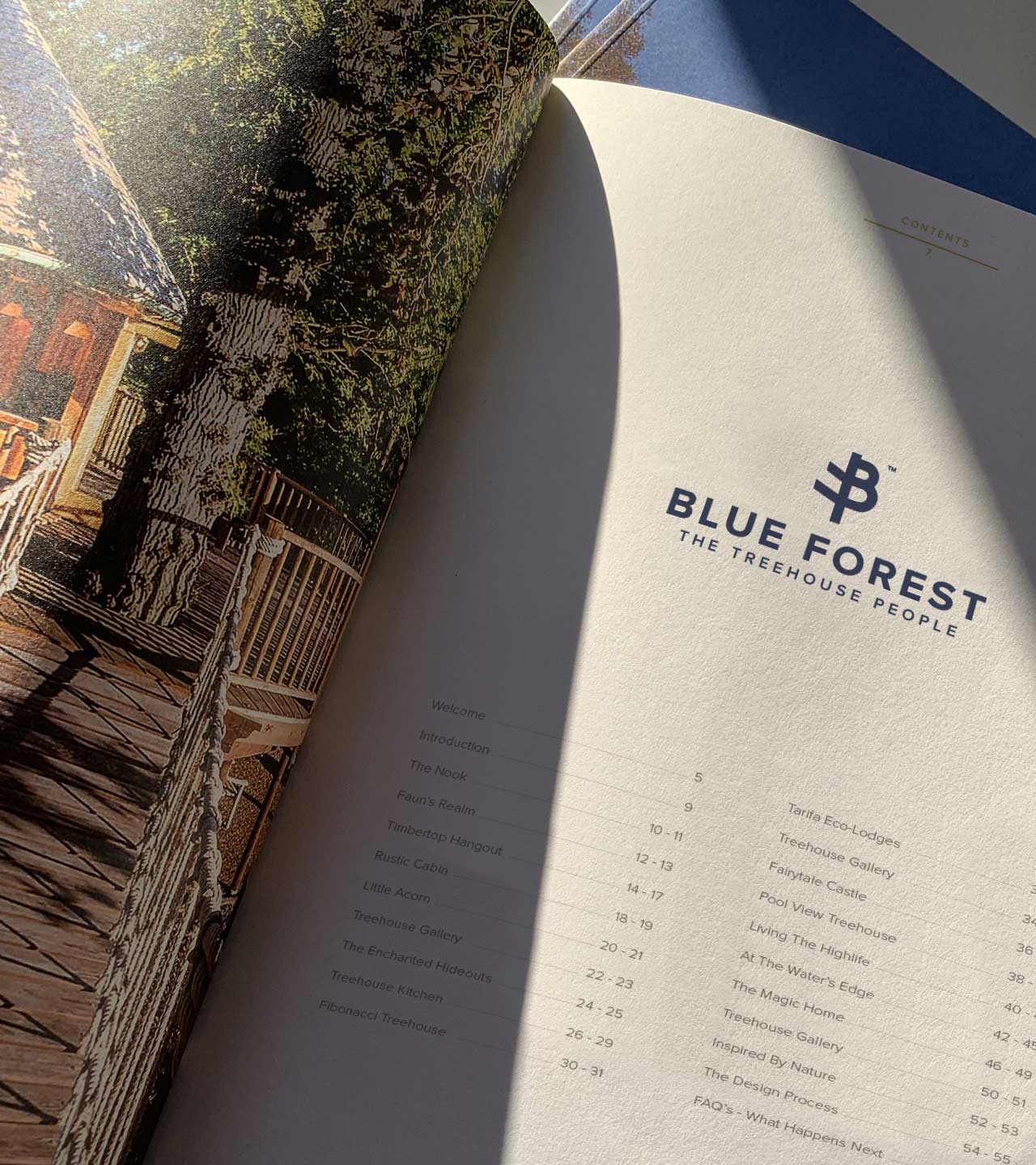
Inside pages
Content has been refreshed with newer projects and brand rules applied throughout. These can be downloaded from the Blue Forest website.
What next?
Have a similar project? Get in touch to discuss. Contact details below.
