The Brief
To develop branding and a suite of brochures each covering a different discipline within the building and decorating industries.
Deliverables
Brochure suite
Concept
Clean, fresh + newly decorated.
The Solution
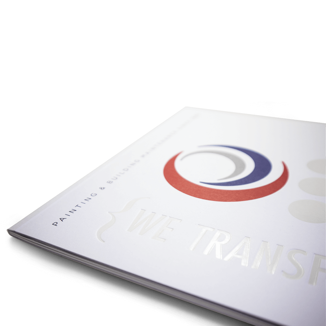
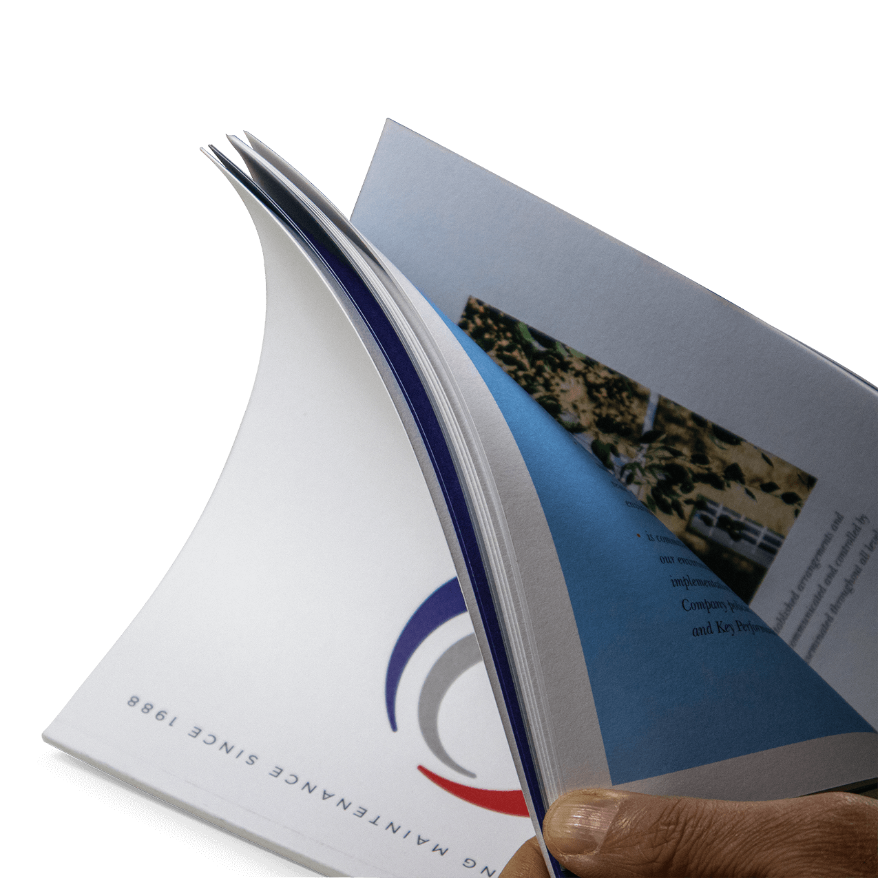
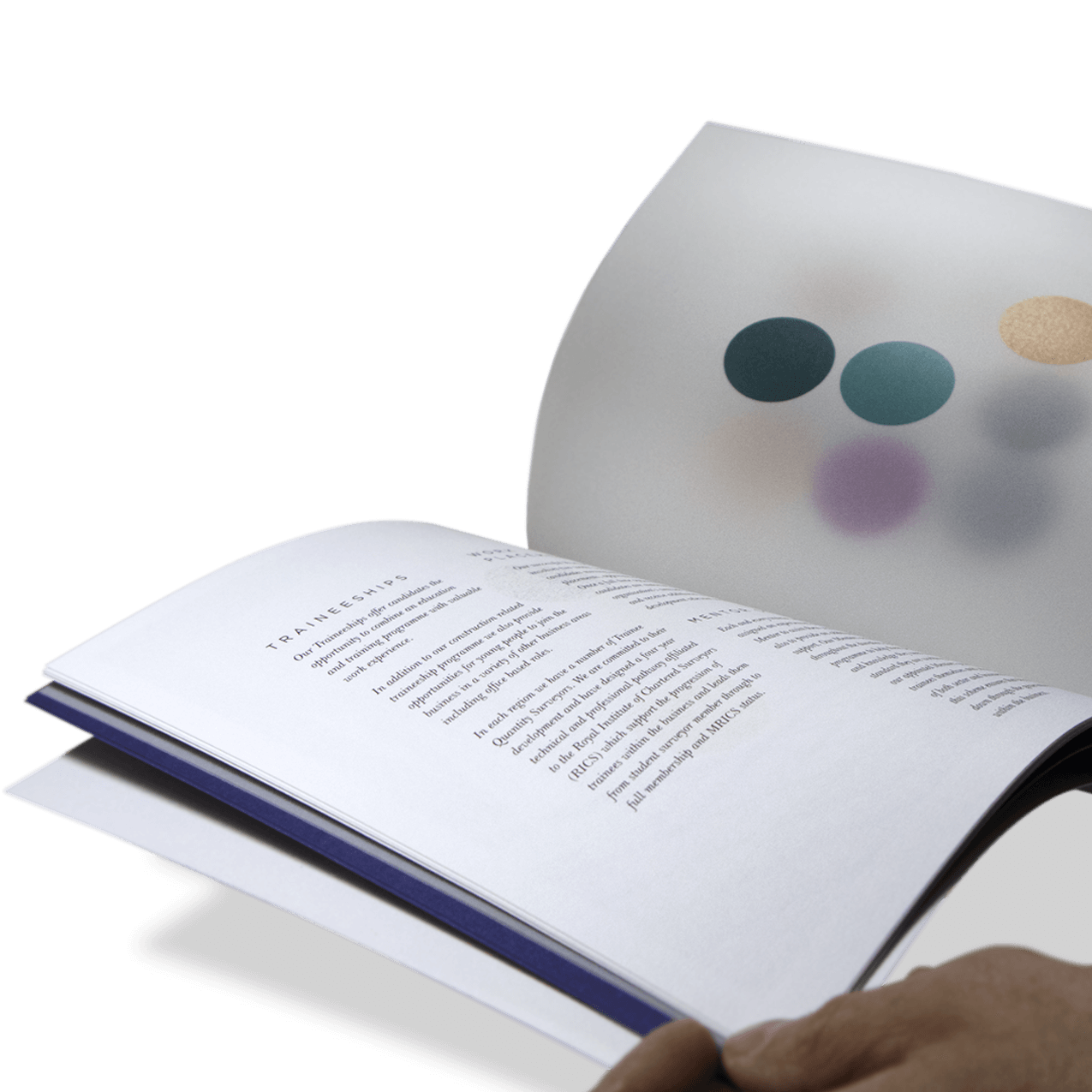
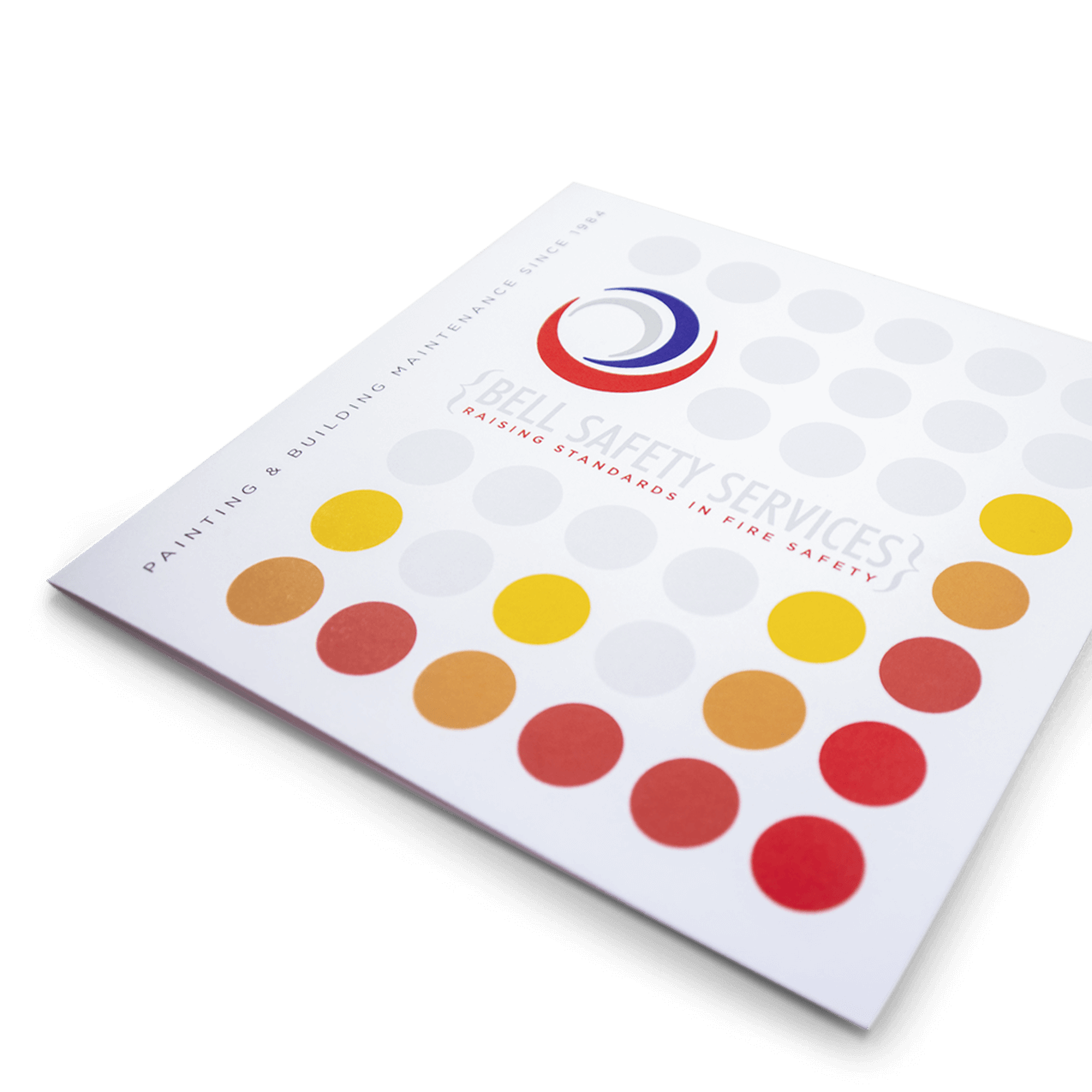
Initially, we focused on the established strong colours from the Bell logo and how well these sit against a white background. We quickly established, a clean white needed to feature heavily in whatever we did. The branding we developed stems from looking down into a freshly opened can of paint reflecting on the core business – where Bell began. From this, we established a new palette of colour, one colour for each discipline. Each discipline would then require its own brochure which would then feature one colour throughout. The main brochure (shown here) introduces the concept and colours. We specified a bright white paper stock for these brochures to reflect that, and made maximum use of white space within the design. The contrast of bright colours against the white paper enforced the perfect finish Bell provides with all of their decorating and maintenance projects.
Paper stock
Bright white uncoated.
Colour
Sparse use of colour with white.
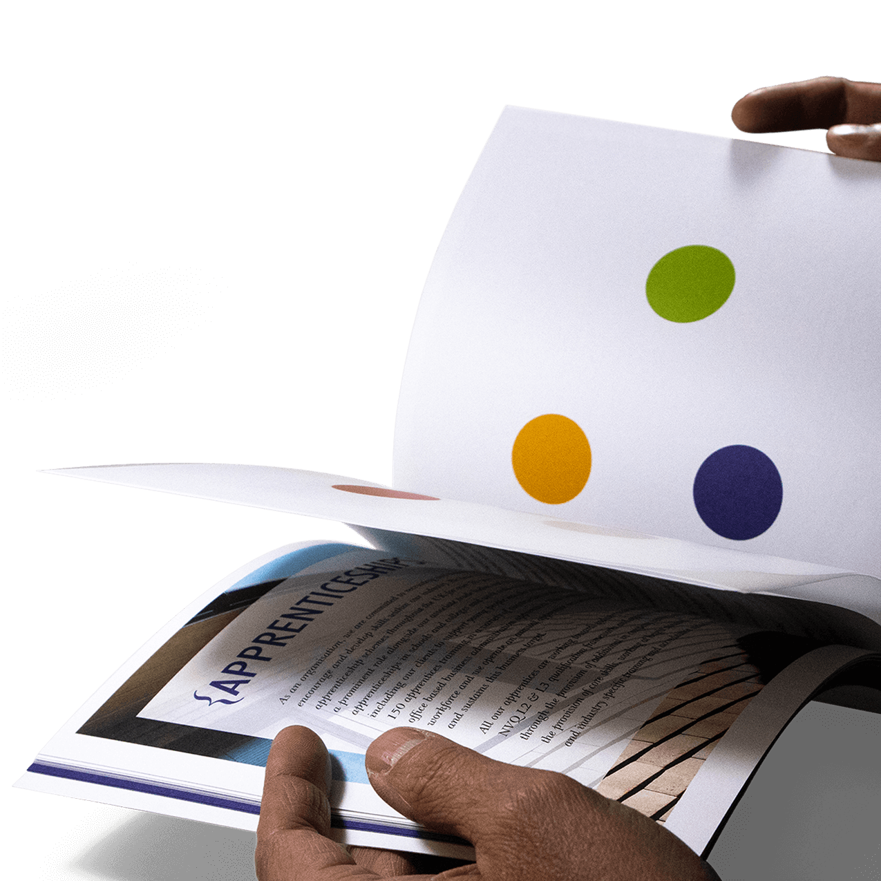
Feature
Tracing paper opens to reveal bright colour.
Fire Safety
Second brochure in series.
Pull-up banners
From fluid guidelines.