The brief
Anglia Ruskin University Students’ Union was really in need of a rebrand. It was vital initially to establish the name, how should the Union be referred to? Ultimately, the most succinct and easily understood solution was agreed upon.
Deliverables
- Logo
- Brand guidelines
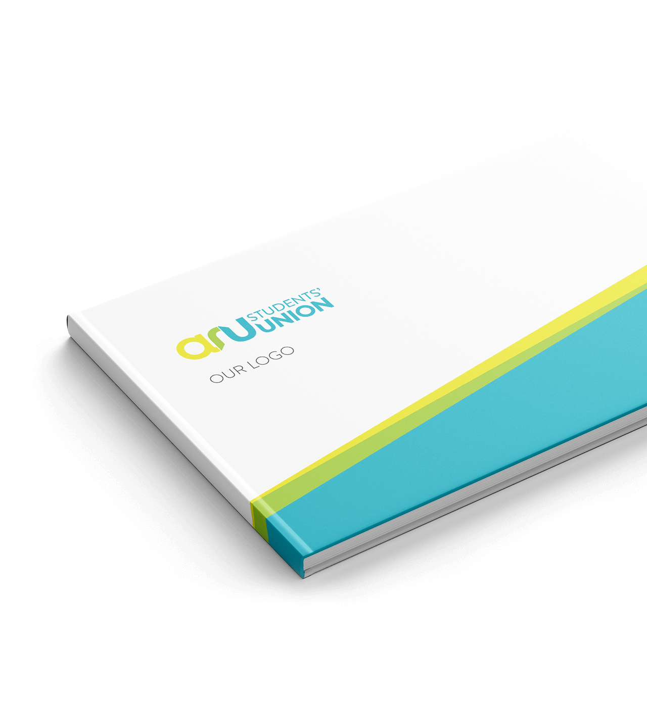
The logo
Ribbon like flow from ‘a’ through to ‘u’.
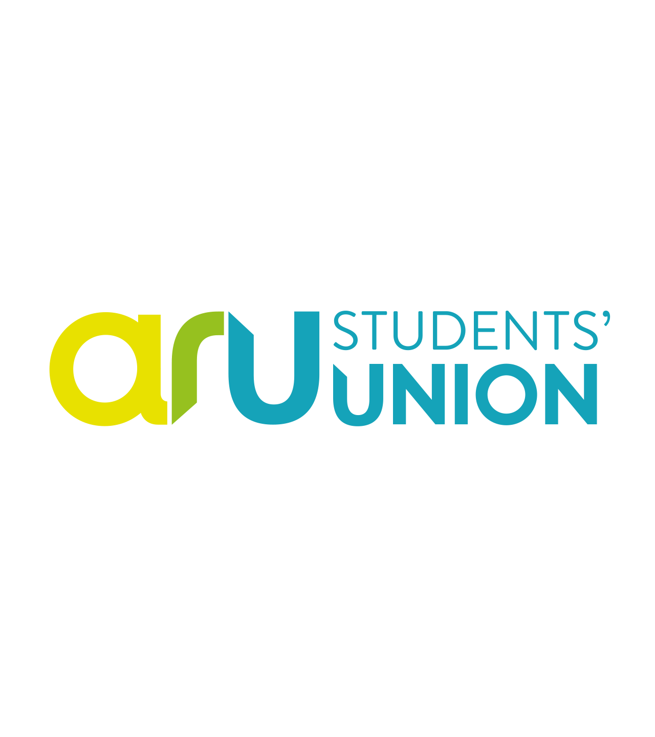
The solution
The strongest quality taken from the brief was that the logo should communicate “Agents of transformation”, suggest movement and change. Gulp provided mood-boards for initial discussion followed by our recommendations and visual thought process including routes dismissed or otherwise (at the client’s request), for comment. Gulp delivered the final logo route with a ribbon-like feeling of flow from the letter ‘A’ through the ‘R’ and into the ‘U’ – suggestive of a journey with colours gaining strength as the journey moves into the Union. The Unique cut of the letter ‘U’ is repeated in the word ‘Union’ to suggest an element of Union ownership. The final colour palette provides a conservative vibrancy that deliberately stands out against the established University palette.
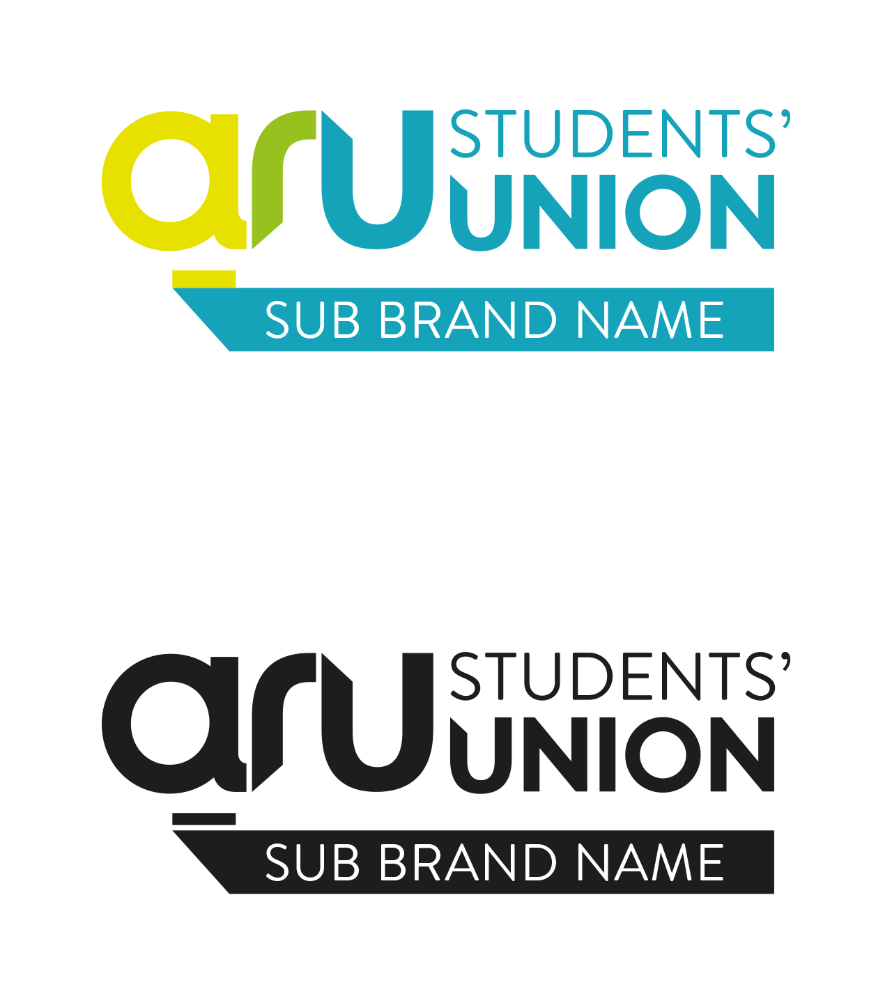
Sub-brands
Showing sub-brand naming container.
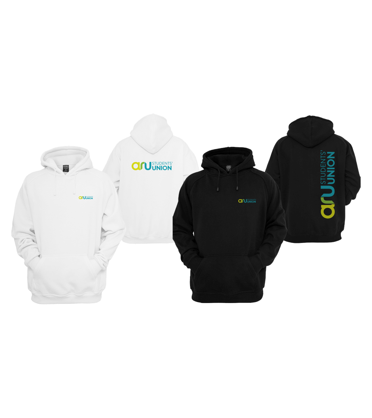
Brand exploration
How the identity translates across various items.
Supporting graphics
Additional graphics explored and established.
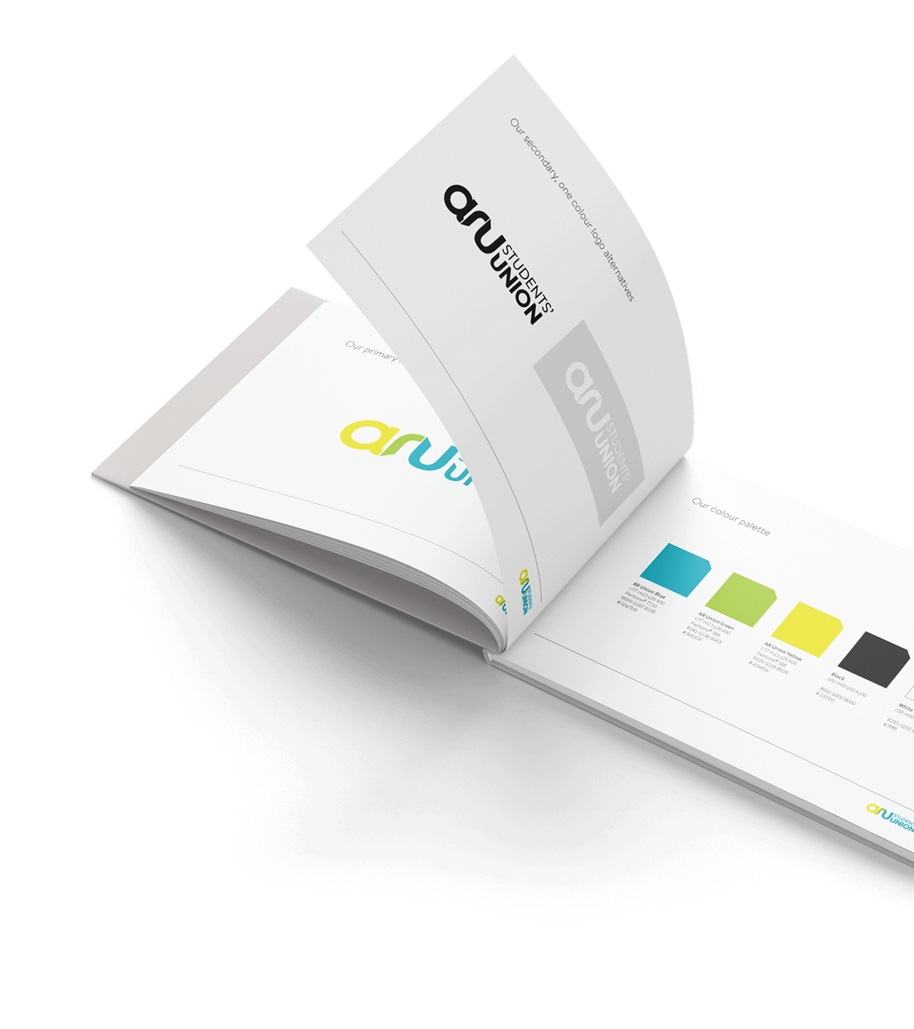
Brand guidelines
Colour ways and brand rules.