The brief
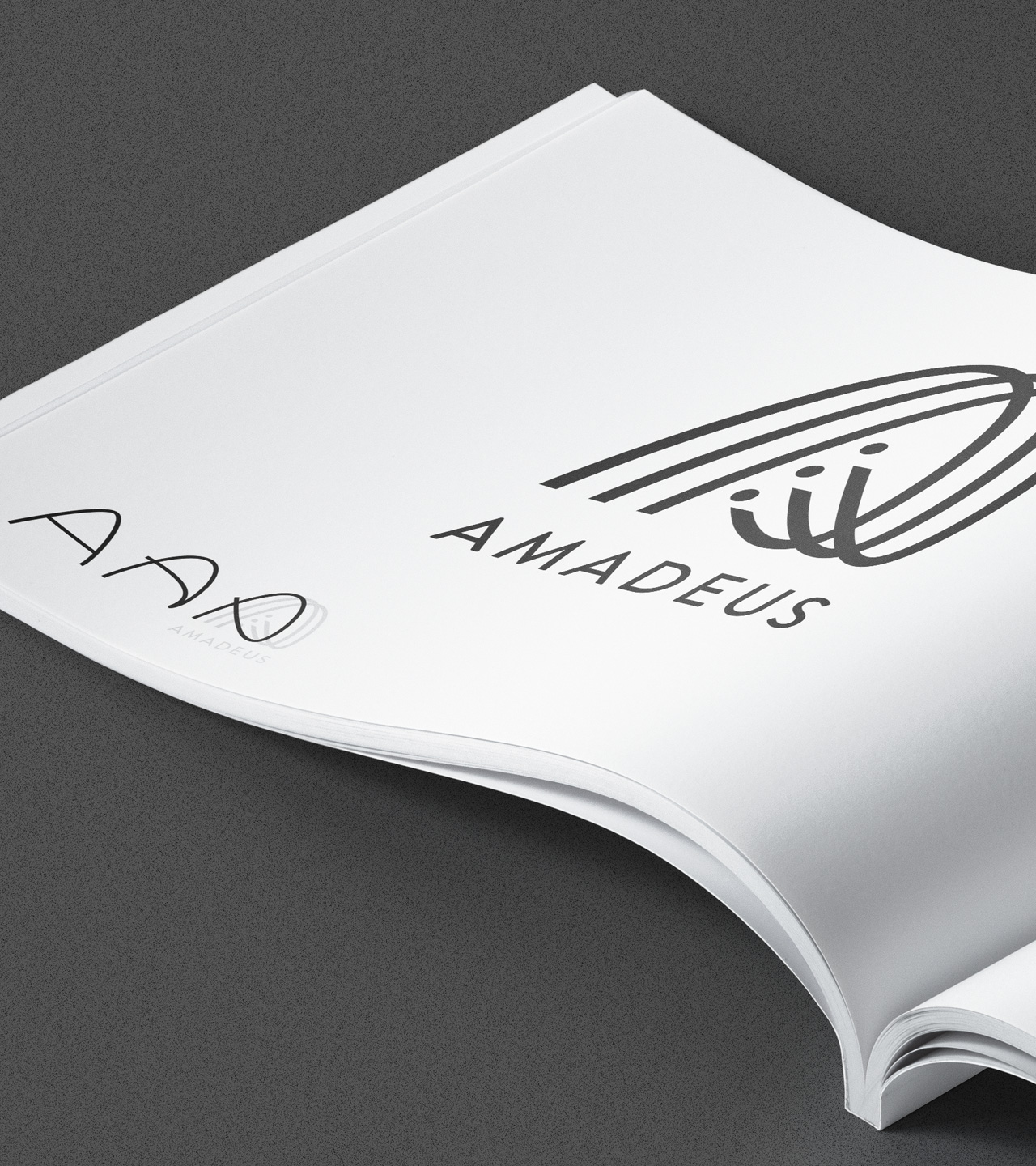
Amadeus was a company in need of a new image. Their product is technically brilliant and of course super-high quality. Their sound proofing very much desirable in the age of working from home. Their Acoustic Solutions needed a new logo to represent the product quality and ability. However it also would need to be bold enough to remain clear when stamped into, or cut out from some of their product’s steel frames.
In addition, the company structure was very confusing to the consumer. As an objective third party, Gulp Creative reviewed and provided a new clear hierarchy for the Group to function at. This would allow products to be categorised neatly into their established brand names, which then needed their own logos to all sit comfortably as part of the group.
Deliverables
Logo and branding
Parent logo
Sub-brand logos
The Solution
With sound being the overarching commonality throughout the group, a sound based solution was the perfect choice for a brand mark to represent all areas. The final chosen design links a stylised letter ‘A’ with string instruments and music direction. The form is triplicated to represent the three directors / founder members.
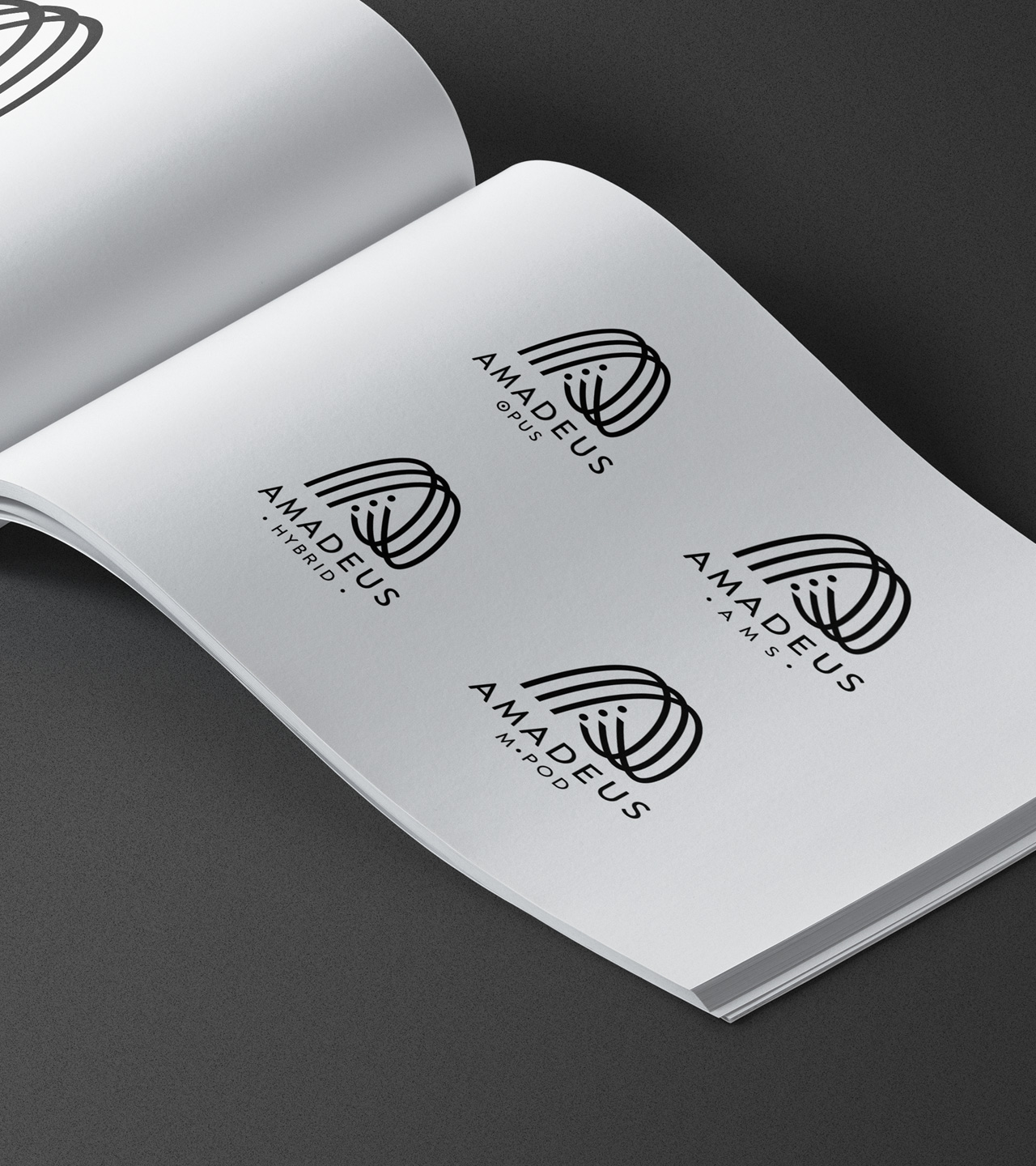
Sub-brands
The group operates in five distinct areas, each one under an existing sub-brand name. The overarching group logo is used throughout to enforce the brand and link with the existing industry reputation. The sub-brands are then identified simply through additional text.
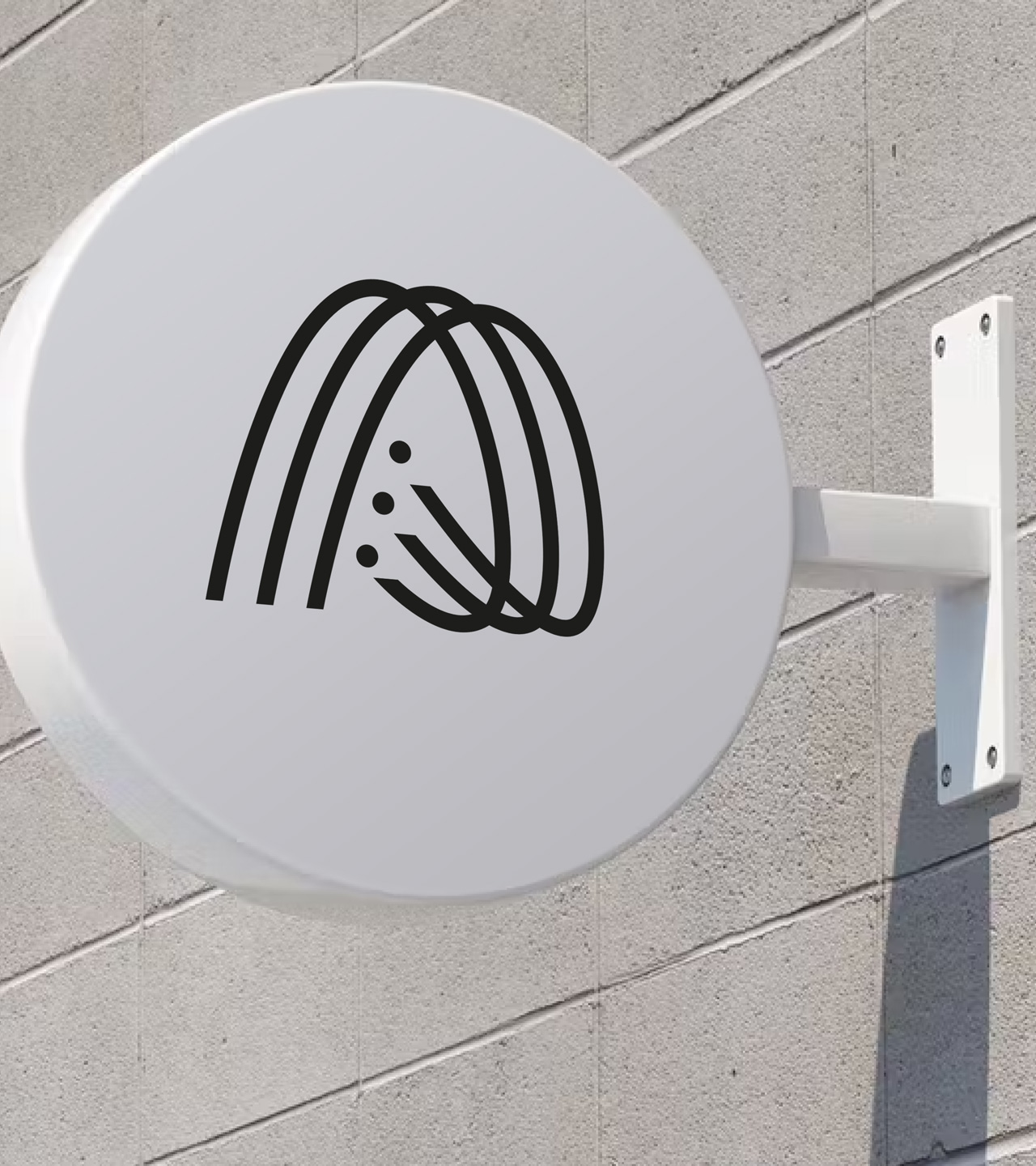
Logo use
Most logos need to work in a variety of situations. That includes signage, vehicle graphics, in print and in digital, including the obvious: websites and social media avatars. All these and more are considered as part of our logo creation process.
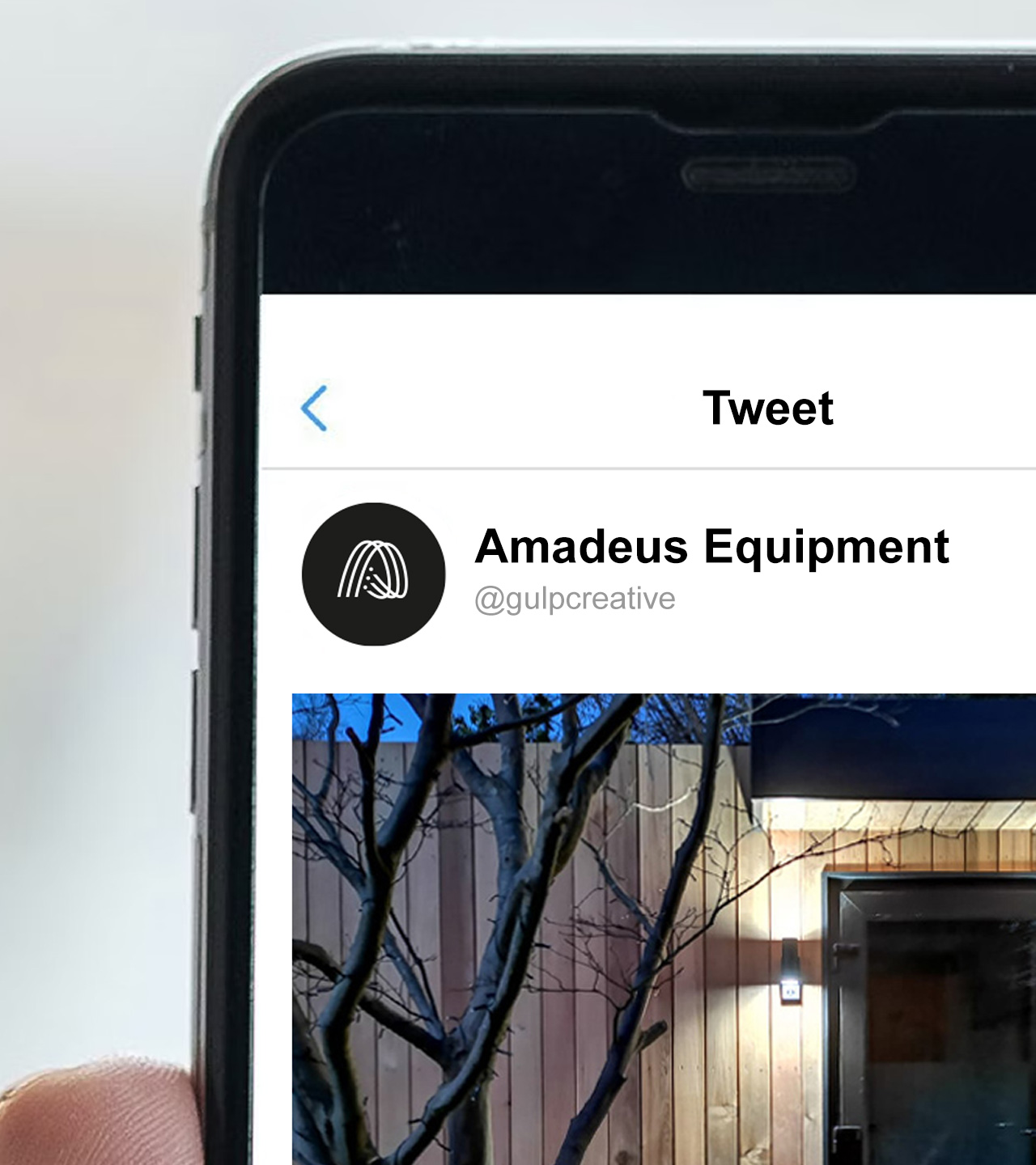
Digital use
Amadeus Equipment logo in use as social media avatar.
How does all that sound?
We’d love to hear about how we might be able to help in your world.
Let’s get together, contact details below.
